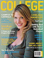
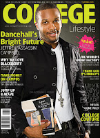
- Looking at existing college magazines
- Visualisation diagram of the front cover
- Using my visualisation diagram to produce it in Photoshop


Similar conventions in college magazines
- Masthead is the largest thing so that it stands out
- Main cover image of a student - normally medium close up shot type, direct gaze
- All have a houstyle of three main colours- gender neutral colours, use of green, blue or yellow etc, establish the brand
- Barcodes on magazine and issue number
- Coverlines (or sell lines) to sell and inform
- Information on the front is relevent to and reflects the genre
File types
JPEG- Photographs, universal, range of different hardwares, devices and softwares, can be compressed as lossy (small so dont take up a lot of storage space and therefore you can save a lot of them) or lossless (bigger and of a higher resolution quality, taking photographs need to be a large lossless file so they are high quality)
TIFF- Front cover for the magazine will be saved as a TIFF file, lossless, used for high quality printing, most posters are normally a TIFF file
PSD- Photoshop document, used to create and edit graphics (shapes, images), lossless file due to working layers
INDD- Contents page and double page spread, layout pages for published documents like magazines, lossless and work in layers
Photoshop = image manipulation software
WHERE AS
inDesign = desktop publishing
When we are "scalling" (scale up, bigger and scale down, smaller)


No comments:
Post a Comment