COVER PAGE
This is the first version of my magazine. I stuck to the house style that I decided withing my proposal and created a mast head as well as choosing the main cover image which I thought was the most appropriate for a front cover due to the conventions that it had within it. This is something that I edited before placing onto my Photoshop magazine document. I also created a graphic which was in the shape of a record as I thought this fit into the genre of a music magazine and also plugs are a convention of all magazines. I also created

I decided that I was unhappy with the use of orange as my house style however I decided to change the orange to green and see whether it looked any better. I liked the way that this looked and believed that it fit in with the indie genre of my magazine. Personally I have never seen a magazine with this as their housestyle colour so I felt as though it would stand out against any other music magazine. I also changed my mast head to something more simple which I believed stood out better.
a
colour as I felt that it did not stand out very well, especially against that image that I had chosen as my main cover image. I considered changing the image

I decided to used a different image as my main cover image as I felt like this one showed more of a direct gaze to the readers so therefore would entise people to read it. I edited this image so it had more of a green colour to it to reflect my house style colours. I also added a smaller image as I believed that this added more points of interest to the front cover. It is also a convention which can be seen on the front of many other music magazines. This image was anchored with text which is where I decided to add the addition of purple to my housestyle colours as I thought that it complimented the green perfectly. I made changes to my plug graphic to make it firt in with the new house style colours, this is something I also did with my coverlines. I changed the way that my main coverline looked so that it would stand out more and fit the music genre of my magazine better.

I edited the main coverline as I felt that the colour I used on the previous version was too bright so I chose to make it more similat to the colour of my masthead. I also added a quote from the feature article as this was a convention of many other magazines and I believed that this would draw readers in, especially due to the quote that I chose as this was very engaging. People would want to read the article to find out what this quote is about.
I made a few changes to this version by adding more coverlines, still in the same style as the original one. I edited the original one by wording it differently and changing the colour to match my masthead more. I also moved my artists name to below the main coverline to see what this would look like. I moved many of my graphics around to see where things fit best also editing the text that is on my plug.
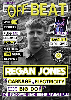
I looked at other magazines and realised that the convention was to have the artists name above the main cover line so I moved this back to where it was before. I also shortened some of the text and I felt like there were too many words so it didn't grab the readers attention as much as I would like it to. I re edited the main cover image to make it black and white as I wanted to see whether this made the text and graphics on the front of my magazine more eye catching. I really liked the way this looked however It made me realise how much green was on the cover so I decided to add more purple as this was another one of my house style colours. Also I changed the wording to make some of my coverlines more coherent. Much of these changes were based on the client feedback I got from Sheffield Publishing House.

I decided that my masthead did not have enought of a strong connotation to music so I looked through other mastheads that I had created and found one that I had originally made. I placed this on the front of my magazine to see whether it was a better alternative and liked the way it looked so I decided to use this once instead. Also I changed the way that my artist name was written, changing the text from white to dark green to connote neon lights, like those which you woukd see at a music venue.
I did not make many adjustments to this version of my magazine except for changing the masthead as this was one I made when my housestyle colours were orange. Therefore I changed the colours to green and also moved where the issue number was positioned on the front of my magazine.

This is the final version of my magazine, I was happy with the large majority of my magazine at this stage however I decided to make an adjustment to the masthead as I believed that the banners behind the words made it look less professional so I decided to change this to make the black outline the text of "Off Beat". I also changed the way which the artist's name was written as I believed that this was a bit boring just being in a banner and did not stand out against the other coverlines. After these changes, I was completely happy with my magazine and decided that this was going to be the final product of my cover page.
 CONTENTS PAGE
This is the first version of my contents page. I created a graphic for my contents page on Photoshop and inserted this into InDesign as a way to continue the branding within my magazine but also show that it is the contents page. The symbol that is in my masthead is that which is on the contents page. I also added banners with text in them. I used my visualisation diagram to start laying out my contents page, however, I did move things around depending on what I thought looked best. I added in an image of my model which I edited on Photoshop and then added two boxes underneath with text and titles. I created a large purple box at the bottom for my reviews section and added an image of The Sundowns playing live music as this links to what the review section is about.
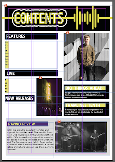
I made adjustments to this version of my contents page by adding in some other banners with text to split up the different articles within my magazines so that it is easy for the readers to find what they are interested in and want to read. I also added in page numbers in green so that they stand out as well as adding an image of the Leadmill next to the live section. This is because it is a live music venue so therefore links to my magazine. I changed the box in my review section to grey as I felt like the purple was too dark and stood out too much whereas the grey still stands out but isn't too intense.

I added different graphics and plugs to this page. The plugs are circles which have text within them that contain information such as page numbers. The other graphics that I added were arrows to show what images or page numbers certain parts of my magazine linked to. When creating my contents page, I wanted it to be easy for the readers to use.

This is the final version of my contents page, I added the actual text which gave each article a name and also had a line underneath to describe what each article was about. Other than that I was happy with the rest of my contents page and believed that it was easy to look at and also was aesthetically pleasing.
DOUBLE PAGE SPREAD
This is the first version of my double page spread. I started by editing the image in Photoshop and then transfering this image over to InDesign. I created some grey columns for my text to sit on top of and then a large drop capital as this was something I saw in many indie music magazines, especially Q magazine.
I changed the drop capital to an "S" as this was the letter that my article starts with. I also inserted the body copy into the columns and played around with sizing as well as bold text.
This is the final version of my double page spread. I changed the size of the column boxes and added all of my article to the spread. Then I experimented with sizing so that the text fit the whole page.
This is the folder which I used in order to organise all of the different versions of my magazine. The folder is named "version controls" so that I stayed organised throughout the creating of the different pages of my magazine. The front page of my magazine I created on Adobe Photoshop and I named this "Off Beat V...". With each change to the magazine I made, I changed the number meaning that you can see the progression in the creation of the magazine. I also did this as it meant that if I changed something and didn't like it, I could go back to the version before. Also if for any reason anything happened to the version of the magazine I was working on, I would not completely loose all my work.


