Monday 18 June 2018

LO4: Evaluation

EVALUATION

SPH Publishing is a brand new publishing house who are opening in Sheffield. They asked me to create a magazine which would cater for a Sheffield based audience. I decided that there wasn’t enough music magazine which were catered for a Sheffield audience, specifically indie music magazines. After the success of many Sheffield indie bands such as the Arctic Monkeys and the Sherlocks, I decided that this genre of magazine would be the best genre to make. This magazine is called “Off Beat” due to the connotations this name has with both the indie and music genres. 
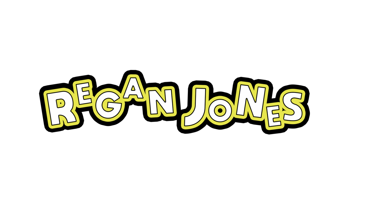
The magazine I created contains four pages, these are a front cover which is used to create a strong branding and entice people to want to read the magazine. The contents page which means that readers know what articles are in the magazine. It also has a double page spread which is about Regan Jones, the main feature in my magazine. 
The front cover of my magazine contains many different conventions which are seen on most magazines, especially music magazines. I used multiple fonts on the cover of my magazine, this was to give it more depth as at first I just used the same font for all the text as that which I had used for my masthead. However I did not like the appearance of this because it made it look too neat and orderly. I decided to use different fonts in order to connote that more messy style which is frequently thought about through the indie/alternative style of music. In order for me to achieve this style, I used a range of different fonts which I found on the website DaFont. As the magazine I am creating has to be original, as said in the brief, this website was okay to use as all the fonts are copyright free. Examples of the fonts I used are “Ayuthaya”, “Embrionic55” and “MOON GET!”. All three of these fonts are san serif which means that it is easier for my audience to read what is on the front cover of my magazine, which is important as it needs to intrigue my target audience to pick up the magazine and read it. In order to create my masthead I used the font “Ayuthaya”, I decided to use this because not only did I like the shape of the letters for this font but when I was creating my masthead on Photoshop, it worked well with the graphic I was creating. I feel as though this font could look too too basic and simple however, if it was used in a big quality on my magazine. Embrionic5 was other font that I used, this is what most of the text that can be seen on the front of the magazine is written in. I especially like the way that this looks when it is just used as a coloured stroke where the text matches the background of the banner as it denoted neon lights which are something that can be seen in many different gig or music venues. I used this effect on words such as “gig” and “live” as I though that the idea of a neon light was most relevant with the connotations of these words. The font “MOON GET!” is the font that I used for purely for “Regan Jones” as this is the name of the person who the main article is about in the magazine. I wanted his name to stand out so I thought that it was best to do this by using a different font, but one that was still in keeping with the house style of the magazine. The fonts I have used on the front cover of the magazine are useful in starting to develop a house style for the magazine, another large contribution towards this is the house style colour scheme. In order to make sure that the text stood out to my audience as well as the whole appearance of my magazine as a whole needed to dit into a house style in order to create and develop a strong branding for “Off Beat”. This makes it easily recognisable. As “Off Beat” is an indie music magazine, it needs to appeal to both genders so I had to be careful with the colours that I was using. Originally the house style colours that I had decided on were orange and blue however when creating my magazine I discovered that these did not give me my desired look. The orange blended into the photographs too much and didn’t stand out as much as I wanted it to. I played around with a range of different colours and finally settled on using a bright green as I believed that this was a gender neutral colour but also connoted the music theme of my magazines as green is eccentric much like indie music.  I decided that I needed another colour to compliment this and purple seemed to look really good with the green. This contrasted nicely as the green I had chosen was bright and the purple was dark but still stood out with the black and white. I believe that the bright eye-catching colours link nicely to the indie theme as they stand out like indie music.  Along side the bright colours I also decided to use neutral colours like grey, black and white, this was just to balance out the vivid green that I used throughout the magazine. Throughout creating my magazine I knew that it was important to stick to the house style colours that I had chosen as I was creating the first issue of a brand new magazine so I creating a strong branding was important so that future issues would be recognisable for readers. 
I decided to have Regan Jones as the main cover image on my front page. This is because he is not only the lead singer of the band, but the person that I interviewed. Originally I wanted this image to be an image of the band as a whole with the lead singer in the middle however other band member were extremely busy so I made the decision that it would be best to just shoot the lead singer. The image I used of Regan Jones has direct gaze so the reader not only sees the importance of this person but also makes them feel more of a personal connection with him as I believe that the use of eye contact within the image will entice my target audience to pick up my magazine. The way that I asked my model to dress was to fit into the house style of my magazine, I requested that Regan Jones wore something that fitted within to the indie genre, giving him guidance to wear something that was a neutral colour. The outfit that Jones wore was versatile as there was a lot of different ways in which it could be styled. Overall I believe that the cover image that I chose for the front cover was successful. I would have preferred to edit my image in a different way and not use a black and white image on my cover page but after lots of experimentation I decided that this was the best way for the photograph to be. 
There are four cover lines on the cover of my magazine which are catchy and relate to the content which is inside. These make the reader intrigued to look at the article and want to read them. An example of this is with the cover line “tramlines exclusives” as the readers knows that the information inside cannot be found elsewhere so would therefore encourage my target audience to pick up my magazine. I as these could include things such as naming other local artists or bands that will feature inside the magazine. The main cover line or “sell line” is there to make the audience want to read the main feature, which is usually a double page spread, which is inside the magazines. 

LO4: Final product [✓]


LO4: Exporting final magazine pages [✓]

I am exporting my front cover for my magazine as a TIFF file. This is a large, high-quality file used for printing and this is a lossless file. Tiff files are industry standard and I want my magazine to be on par with my competitors such as the local Sheffield magazine, Exposed, or Q magazine which is an indie music magazine just like "Off Beat". Tiff files are universally compatible meaning that it can be viewed on any device, this is good if I decided to put my magazine online as my audience are digital natives so therefore they grew up in an age of technology. This means they will be expected to access mt magazine on a range of different platforms. Due to a TIFF file being high quality and lossless it will take up a lot of storage space but it is worth this cause of the distribution of my high-quality product.


To actually export my magazine I had to open my final version of my magazine and click on save as. I then changed the file type form psd to TIFF due to this being the file type appropriate for printing. I saved this into my version controls folder as well as the psd document so should anything happen to the magazine I can just export it as a TIFF file again.

I would need to export my magazine at 300 resolution. This is because I need to make sure that it is high enough quality for print.

If I was too, in the future decide to put my magazine online or on an app to make it available for a digital native audience, I would need to change the file to 72 resolution. This is so that it is still a high-quality file but not too large to store online and would take a long time to load.


When exporting my contents and double page spread I will need to export the pages as a PDF file. This is still a large lossless file meaning that it is high quality. PDF's are exportable, easy to upload and download online and is also something that everyone can access. This is a universal file and is therefore good if I decide to put my magazine online and also good for printing. Much like exporting my cover page, I made sure that I saved another copy of my magazine as a indd document so that if anything was to happen to my double page spread and contents page, I would be able to re-export it.


In the magazine industry, both TIFF and PDF files can be sent straight to reprographics for printing. When something is sent as a PDF all images, text and graphics stay the same in terms of alignment.

LO4: Subediting [✓]

My peer subedited my article, correcting my spelling and grammar as well as giving some improvements on how I can word certain sections of the article. I will look through the feedback that Damian has given me and edit my article accordingly so that it reads more fluently. 

Sheffield. A place where some of the most successful artists such as Milburn and Arctic Monkeys have been born and bred. The city is still thriving, growing new talent everyday, more so than ever before. The newest of talent being The Sundowns, who are only half a year old maybe say ‘they've only been around for 6 months’, saying they're only ‘6 months old’ sounds too formal. The dropping of their first EP, signals the start of something big for the Sheffield based indie alternate rock band. The band is a four piece with members Regan Jones, Ethan Halligan, Frankie Costello and Jake Miller. We managed to catch up with the lead singer himself, Regan Jones.  

After performing at Sheffield’s very own O2 Academy, Regan Jones sat down and chatted with us over a pint, “I’d probably say that you'd most likely find me in the pub with my mates in my spare time. I love getting stuck into a game of footy though too.”. However it is quite obvious that music is always on Regan’s mind, even during his downtime, with one of the bands oldest hits being “Jumpers for Goalposts’. The Sundowns have many original songs with Jones being the mastermind behind the lyrics, “I just get a line and work with it” he comments, “I find the best way to get inspiration for a song is just taking things that are important to me or that stand out.”. We can see that the ideas behind the lyrics for “Jumpers for Goalposts” are heavily inspired by his passion for football, “the song is just mainly a reflection on my own personal childhood memories, but I feel like many lads my age could relate.”. The thing that sets the music of The Sundowns apart from the rest is that their lyrics really are relatable for so many different people could talk about how the lyrics are written in this way to appeal to people a wider range of people as well which could boost the bands popularity, yet still manage to be different from the clique you mean cliché? music we listen to today.  
Music has always been a lifelong ambition of Jones’, “Ive been influenced by many different artists, The Stone Roses, Morrissey, Little man Tate and Milburn to name a few. Liam Fray has always been my biggest influence however, seeing him was what made me decided decide* that music was something I really wanted to be involved with”. From a young age Jones has been involved in music, with his nan being a big influence on him. “When it comes to music I am mainly self-taught, however growing up my nan did teach me how to play the piano, I think this has had a big impact on what I am doing now”.   Structure it so that the nan seems like a bigger influence from his childhood. It flows better and explains how he actually got into music in the first place 

Before The Sundowns were around, Jones was a solo artist. With the band only forming a short while ago, we wondered how it came about and Jones has the story to tell. “I was just sat on a tram on my way to town when I saw this guy. Ethan. He had a Gretsch guitar and looked cool. So I took his name , messaged him and then The Sundowns was born”. The creation of the band seems to have had a very positive impact on all the boys lives, with it sparking up a friendship that will last a lifetime. Lack of information, add a bit more to the story than ‘I took his name down, and bam sundown's were born’  

“Back on the grind”, not only an example of Jones clever way with words but a phrase that describes The Sundowns perfectly.“I feel the proudest when I’m up there on that stage and people are our singing back the lyrics to us. The feeling is surreal along with the support.” After only just releasing their first EP, The Sundowns were back in the studio doing what they do best. ”Our following is what motivates us the most” was what Regan commented when I asked him why they were creating new tunes so soon. Having been given the honor to listen to a preview of one of their new original hits, I can honestly say that the band just keeps getting better and better, “even bigger things are to come”. Id restructure it so the grind seems like they’ve got a reason to grind out new music. Maybe move the section about their fans being the reason they make music to the top and then follow it with the bit about the grind.  

When Jones was asked to describe what people should expect from their gigs, the words he used were “carnage, electricity and a big do” and he wasn’t wrong. Having been lucky enough to have attended the bands O2 performance I can confirm that the amazing music I heard having first listened to the bands EP on Spotify was more than topped due to not only the brilliant music but the atmosphere that they created. Having experienced this first hand I can honestly say that The Sundowns are not one to miss. Get yourselves down to there up and coming gig headlining Cafe Totem on the December 8th and experience Sheffield’s next big thing for yourself.  Try and end it with the words “Carnage, Electricity and a Big Do”. it sounds better compared to ‘experience the next big them for yourself 

Based on the feedback I was given, overall there was not many things that I needed to change within the article. A strength of what I have written for my body copy is that it is easy to read and understand. Although the structure is a weakness of my article, there are only a few minor changes to make in order to make it more powerful and gripping. These things don't effect the overall article, and are just things that I need to change in order to make my readers want to read on to the end. Another strength of the feature is that overall it is very well written, the article will engage the readers and it contains a lot of information whilst still being in an gonzo style, also being the right amount of informal. A weakness is that some parts of my article need a bit more information adding, like to the story about how the band met. This is something small that I can have and will have a big impact on the whole feature. 

LO3/4: Production Materials, Evidence of Editing and Review of assets [✓]

REVIEW OF IMAGES


The strengths of this image are the way in which the model has a direct gaze with the camera so therefore they will seem more connected with the reader. I like the pose which my model is stood in as I feel like this fits into the genre of magazine. The models face is engaging and friendly but also moody. A weakness is that this image is not the best quality, however, I managed to fix this by turning the image black and white. 


The strengths of this image are the colours which are in it and the connotations which the image has about music. I really like that this is an action shot of the band playing their music as it really captures the essence of the magazine. The weakness of this image, however, is that the guitarist in the back is not completely in focus, however, this doe not affect the quality of the image.


The pose that the model is stood in within this image is a strong point. He looks relaxed but at the same time is posing which is something that I wanted to bring to the magazine as there is a relaxed element to the article but also this still fits the conventions of a magazine image. The weakness of this image, however, is the colour as the background of the image did not match my house style colours so I made this black and white. This means that there isn't much colour within the image which is something that I am not that keen on. 


The strenghts of this image are that the lighting has still managed to be captures even though it is black and white. I like how this is an action shot and features the lead singer and bassist however its weakness is that it doesnt feature the whole band as this was hard for me to get a shot of when taking images. I feel as though it denotes the genre of a music magazine very well.


This image is strong because of the lighting in the image. The contrasts between the neon light and dark sky make the image interesting. Also I think the way that I have edited it so that it is fitting with my housestyle colours improves the image. A weakness of this though is that it take away the Leadmill's classic branding with the red sign which is how it is recognised throughout Sheffield. The image however is successful as it denotes a live music venue which is something that is included within my magazine.

The final image I used is strong because of the use of house stle colours within the editing of the image. I like that the rest of the image is black and white with just pops of the colours taht are used throughout my magazine. Overall I really like this image, especially because of the models pose and facial expressions. The only thing that is a weakness in my eyes is the composition as I do not like the line from the wall which runs down the left hand side of the image. 


REVIEW OF MASTHEAD


This is my masthead design. I think it is successful because it has a lot of music connotations like the sound waves which help to create a strong branding. I like how the house style colours are included but not overpowering as this could make it seem unprofessional and appeal to a younger target audience. The addition of black and white means that the masthead looks more sophisticated whilst still being eyecatching so that people notice the branding of the magazine. However, I feel that the weakness of this masthead is the font that I used as I had to find one where the line through the "E" and "A" was at the same level. This meant that I could not use the font that I wanted but overall the outcome looked good.

REVIEW OF THREE GRAPHICS


This is a graphic that I created for the cover of my magazine. The strengths of this are that it looks like a record player which was the look that I was going for. This means that there is a strong connotation with the music theme which my magazine follows. The record fits into my house style colours by having a green middle, further strengthening my branding. The font however is a weakness of this as I feel like it may look a bit childish and doesn't fit with the other fonts used within my magazine.


In order to create this graphic, these were the steps that I took:


When planning and creating this graphic I had the genre of my magazine in mind. Record collecting is something that many of my target audience are interested in and is a growing trend, especially within the indie music community. With this in mind I decided that creating a plug which was not only eye catching but also connoted what was available inside the magazine, through both the shape of the plug and the text which is written on it. The green centre of the graphic fits into my house style colours which I believed was important as this can be seen throughout my magazine and is there in order to create a strong branding. Plugs are a convention of magazines so therefore I knew that I needed to include on one the front of my magazine. 


This is a graphic I created for the cover of my magazine which has the name of the lead singer, who my article is written about. I did not want this to look boring however I also didn't want to take away from the masthead of my magazine. This is successful as it is interesting to look at and will attract the readers attention. It is also easy to read which is important when being an asset on a magazine. However I feel like the font looks slightly too much like the masthead and could get confused with it but it shows that I find my house style important.

In order to create this graphic I used the following steps:


When creating this graphic I knew that I had to make it interesting as it is one of the most important parts on the cover page of my magazine however I did not want the design of it to clash too much with my masthead, but instead to compliment it. I believe that the graphic follows conventions of indie music as it is written in a way which compliments the way in which many different bands logos. An example of this is the band "The Libertines" logo which I took inspiration from. The way in which the text doesn't all sit on one level but has different sizes and heights was done as it connotes sheet music, having different sizes, lines and notes. I believe that the graphic is eye-catching and would encourage the target audience of my magazine to pick it up and have a read.

This is an asset that I designed to be a cover line on the front cover of my magazine. This is successful because I believe that by choosing to make one word in a different font it stands out. This also looks like neon lights which is the look I was going for due to my magazine being about music and neon lights being a connotation to this. I have not chosen the most important word to be in the different colour, this should have been "win". Overall I this is a successful asset.

This video shows how I created this graphic. I used tools such as the rectangle tool, text tool and the layer style tool to create my cover line.

When creating my cover line I made sure that it was interesting and engaging. I added a black banner behind it as this made the text stand out on the front cover but also is a convention of many magazines so I decided that I should include it on mine. The connotations of live music are things such as flashing or neon light which I have tried to portray through both the stroke and the colours that I have used as the vivid green connotes excitement. 

Monday 30 April 2018

LO4: Client and focus group feedback [✓]


This is some feedback that Sheffield Publishing House gave to me on one version of my magazine. I took this feedback and used it to make improvements to my magazine. 


I also created a survey and sent it out to a focus group, these were people within my target audience of 16 to 25-year olds. These are the responses that I got about my magazine. Overall my feedback was positive with many people saying that it was good however I did get some improvements. My focus group liked both the contents page and cover page very much, however, did say that I should improve the resolution of my masthead. The feekback I got from my survey is something that is important to me as it is from my target audience so I will take everything they have taken into consideration and make the appropriate alterations.   


Monday 23 April 2018

LO4: Version Controls [✓]

COVER PAGE

This is the first version of my magazine. I stuck to the house style that I decided withing my proposal and created a mast head as well as choosing the main cover image which I thought was the most appropriate for a front cover due to the conventions that it had within it. This is something that I edited before placing onto my Photoshop magazine document. I also created a graphic which was in the shape of a record as I thought this fit into the genre of a music magazine and also plugs are a convention of all magazines. I also created
I decided that I was unhappy with the use of orange as my house style however I decided to change the orange to green and see whether it looked any better. I liked the way that this looked and believed that it fit in with the indie genre of my magazine. Personally I have never seen a magazine with this as their housestyle colour so I felt as though it would stand out against any other music magazine. I also changed my mast head to something more simple which I believed stood out better.

a
colour as I felt that it did not stand out very well, especially against that image that I had chosen as my main cover image. I considered changing the image


I decided to used a different image as my main cover image as I felt like this one showed more of a direct gaze to the readers so therefore would entise people to read it. I edited this image so it had more of a green colour to it to reflect my house style colours. I also added a smaller image as I believed that this added more points of interest to the front cover. It is also a convention which can be seen on the front of many other music magazines. This image was anchored with text which is where I decided to add the addition of purple to my housestyle colours as I thought that it complimented the green perfectly. I made changes to my plug graphic to make it firt in with the new house style colours, this is something I also did with my coverlines. I changed the way that my main coverline looked so that it would stand out more and fit the music genre of my magazine better.

I edited the main coverline as I felt that the colour I used on the previous version was too bright so I chose to make it more similat to the colour of my masthead. I also added a quote from the feature article as this was a convention of many other magazines and I believed that this would draw readers in, especially due to the quote that I chose as this was very engaging. People would want to read the article to find out what this quote is about.
I made a few changes to this version by adding more coverlines, still in the same style as the original one. I edited the original one by wording it differently and changing the colour to match my masthead more. I also moved my artists name to below the main coverline to see what this would look like. I moved many of my graphics around to see where things fit best also editing the text that is on my plug.
I looked at other magazines and realised that the convention was to have the artists name above the main cover line so I moved this back to where it was before. I also shortened some of the text and I felt like there were too many words so it didn't grab the readers attention as much as I would like it to.  I re edited the main cover image to make it black and white as I wanted to see whether this made the text and graphics on the front of my magazine more eye catching. I really liked the way this looked however It made me realise how much green was on the cover so I decided to add more purple as this was another one of my house style colours. Also I changed the wording to make some of my coverlines more coherent. Much of these changes were based on the client feedback I got from Sheffield Publishing House.


I decided that my masthead did not have enought of a strong connotation to music so I looked through other mastheads that I had created and found one that I had originally made. I placed this on the front of my magazine to see whether it was a better alternative and liked the way it looked so I decided to use this once instead. Also I changed the way that my artist name was written, changing the text from white to dark green to connote neon lights, like those which you woukd see at a music venue.

I did not make many adjustments to this version of my magazine except for changing the masthead as this was one I made when my housestyle colours were orange. Therefore I changed the colours to green and also moved where the issue number was positioned on the front of my magazine.


This is the final version of my magazine, I was happy with the large majority of my magazine at this stage however I decided to make an adjustment to the masthead as I believed that the banners behind the words made it look less professional so I decided to change this to make the black outline the text of "Off Beat". I also changed the way which the artist's name was written as I believed that this was a bit boring just being in a banner and did not stand out against the other coverlines. After these changes, I was completely happy with my magazine and decided that this was going to be the final product of my cover page.


CONTENTS PAGE

This is the first version of my contents page. I created a graphic for my contents page on Photoshop and inserted this into InDesign as a way to continue the branding within my magazine but also show that it is the contents page. The symbol that is in my masthead is that which is on the contents page. I also added banners with text in them. I used my visualisation diagram to start laying out my contents page, however, I did move things around depending on what I thought looked best. I added in an image of my model which I edited on Photoshop and then added two boxes underneath with text and titles. I created a large purple box at the bottom for my reviews section and added an image of The Sundowns playing live music as this links to what the review section is about.


I made adjustments to this version of my contents page by adding in some other banners with text to split up the different articles within my magazines so that it is easy for the readers to find what they are interested in and want to read. I also added in page numbers in green so that they stand out as well as adding an image of the Leadmill next to the live section. This is because it is a live music venue so therefore links to my magazine. I changed the box in my review section to grey as I felt like the purple was too dark and stood out too much whereas the grey still stands out but isn't too intense.


I added different graphics and plugs to this page. The plugs are circles which have text within them that contain information such as page numbers. The other graphics that I added were arrows to show what images or page numbers certain parts of my magazine linked to. When creating my contents page, I wanted it to be easy for the readers to use.


This is the final version of my contents page, I added the actual text which gave each article a name and also had a line underneath to describe what each article was about. Other than that I was happy with the rest of my contents page and believed that it was easy to look at and also was aesthetically pleasing.


 DOUBLE PAGE SPREAD 

This is the first version of my double page spread. I started by editing the image in Photoshop and then transfering this image over to InDesign. I created some grey columns for my text to sit on top of and then a large drop capital as this was something I saw in many indie music magazines, especially Q magazine.
I changed the drop capital to an "S" as this was the letter that my article starts with. I also inserted the body copy into the columns and played around with sizing as well as bold text.

This is the final version of my double page spread. I changed the size of the column boxes and added all of my article to the spread. Then I experimented with sizing so that the text fit the whole page.


This is the folder which I used in order to organise all of the different versions of my magazine. The folder is named "version controls" so that I stayed organised throughout the creating of the different pages of my magazine. The front page of my magazine I created on Adobe Photoshop and I named this "Off Beat V...". With each change to the magazine I made, I changed the number meaning that you can see the progression in the creation of the magazine. I also did this as it meant that if I changed something and didn't like it, I could go back to the version before. Also if for any reason anything happened to the version of the magazine I was working on, I would not completely loose all my work.