REVIEW OF IMAGES
 The strengths of this image are the way in which the model has a direct gaze with the camera so therefore they will seem more connected with the reader. I like the pose which my model is stood in as I feel like this fits into the genre of magazine. The models face is engaging and friendly but also moody. A weakness is that this image is not the best quality, however, I managed to fix this by turning the image black and white.
  The strengths of this image are the colours which are in it and the connotations which the image has about music. I really like that this is an action shot of the band playing their music as it really captures the essence of the magazine. The weakness of this image, however, is that the guitarist in the back is not completely in focus, however, this doe not affect the quality of the image.
The pose that the model is stood in within this image is a strong point. He looks relaxed but at the same time is posing which is something that I wanted to bring to the magazine as there is a relaxed element to the article but also this still fits the conventions of a magazine image. The weakness of this image, however, is the colour as the background of the image did not match my house style colours so I made this black and white. This means that there isn't much colour within the image which is something that I am not that keen on.

The strenghts of this image are that the lighting has still managed to be captures even though it is black and white. I like how this is an action shot and features the lead singer and bassist however its weakness is that it doesnt feature the whole band as this was hard for me to get a shot of when taking images. I feel as though it denotes the genre of a music magazine very well.

This image is strong because of the lighting in the image. The contrasts between the neon light and dark sky make the image interesting. Also I think the way that I have edited it so that it is fitting with my housestyle colours improves the image. A weakness of this though is that it take away the Leadmill's classic branding with the red sign which is how it is recognised throughout Sheffield. The image however is successful as it denotes a live music venue which is something that is included within my magazine.

The final image I used is strong because of the use of house stle colours within the editing of the image. I like that the rest of the image is black and white with just pops of the colours taht are used throughout my magazine. Overall I really like this image, especially because of the models pose and facial expressions. The only thing that is a weakness in my eyes is the composition as I do not like the line from the wall which runs down the left hand side of the image.
REVIEW OF MASTHEAD
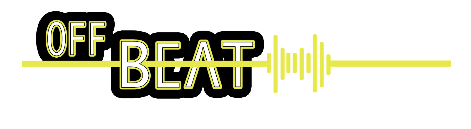
This is my masthead design. I think it is successful because it has a lot of music connotations like the sound waves which help to create a strong branding. I like how the house style colours are included but not overpowering as this could make it seem unprofessional and appeal to a younger target audience. The addition of black and white means that the masthead looks more sophisticated whilst still being eyecatching so that people notice the branding of the magazine. However, I feel that the weakness of this masthead is the font that I used as I had to find one where the line through the "E" and "A" was at the same level. This meant that I could not use the font that I wanted but overall the outcome looked good.
REVIEW OF THREE GRAPHICS
 This is a graphic that I created for the cover of my magazine. The strengths of this are that it looks like a record player which was the look that I was going for. This means that there is a strong connotation with the music theme which my magazine follows. The record fits into my house style colours by having a green middle, further strengthening my branding. The font however is a weakness of this as I feel like it may look a bit childish and doesn't fit with the other fonts used within my magazine.
In order to create this graphic, these were the steps that I took:


When planning and creating this graphic I had the genre of my magazine in mind. Record collecting is something that many of my target audience are interested in and is a growing trend, especially within the indie music community. With this in mind I decided that creating a plug which was not only eye catching but also connoted what was available inside the magazine, through both the shape of the plug and the text which is written on it. The green centre of the graphic fits into my house style colours which I believed was important as this can be seen throughout my magazine and is there in order to create a strong branding. Plugs are a convention of magazines so therefore I knew that I needed to include on one the front of my magazine.
In order to create this graphic I used the following steps:


When creating this graphic I knew that I had to make it interesting as it is one of the most important parts on the cover page of my magazine however I did not want the design of it to clash too much with my masthead, but instead to compliment it. I believe that the graphic follows conventions of indie music as it is written in a way which compliments the way in which many different bands logos. An example of this is the band "The Libertines" logo which I took inspiration from. The way in which the text doesn't all sit on one level but has different sizes and heights was done as it connotes sheet music, having different sizes, lines and notes. I believe that the graphic is eye-catching and would encourage the target audience of my magazine to pick it up and have a read.

This is an asset that I designed to be a cover line on the front cover of my magazine. This is successful because I believe that by choosing to make one word in a different font it stands out. This also looks like neon lights which is the look I was going for due to my magazine being about music and neon lights being a connotation to this. I have not chosen the most important word to be in the different colour, this should have been "win". Overall I this is a successful asset.
This video shows how I created this graphic. I used tools such as the rectangle tool, text tool and the layer style tool to create my cover line.
When creating my cover line I made sure that it was interesting and engaging. I added a black banner behind it as this made the text stand out on the front cover but also is a convention of many magazines so I decided that I should include it on mine. The connotations of live music are things such as flashing or neon light which I have tried to portray through both the stroke and the colours that I have used as the vivid green connotes excitement.
No comments:
Post a Comment